


Responsive Web Design: The Key to Better User Engagement
Responsive design means the page shifts its layout to fit different screens, and a design system powers this. Making the interface easy to use. It adjusts automatically so things fit right, no matter the phone or tablet. Seems like it works pretty well for most people now. Users always get a consistent experience of layout switching between phone, tablet, and desktop devices. Responsive website design delivers content that maintains visual clarity and operational simplicity throughout all display screens.
For example, think about opening an online store on your phone. The mobile-responsive design functions correctly when users can read the text, and the images change size according to their needs. In fact, according to Statista, over 58% of global website traffic comes from mobile devices. Businesses now concentrate on developing responsive web solutions that enable users to access their services from different devices.
Responsive web design extends beyond visual design elements. The system enhances user experience by increasing navigation efficiency and improving loading times and overall usability. Natural screen adaptation by your website design leads to extended visitor time and increased website exploration. A digital experience improves through a mobile-friendly website that uses effective design principles.
The Role of Mobile Compatibility in Modern Web Design
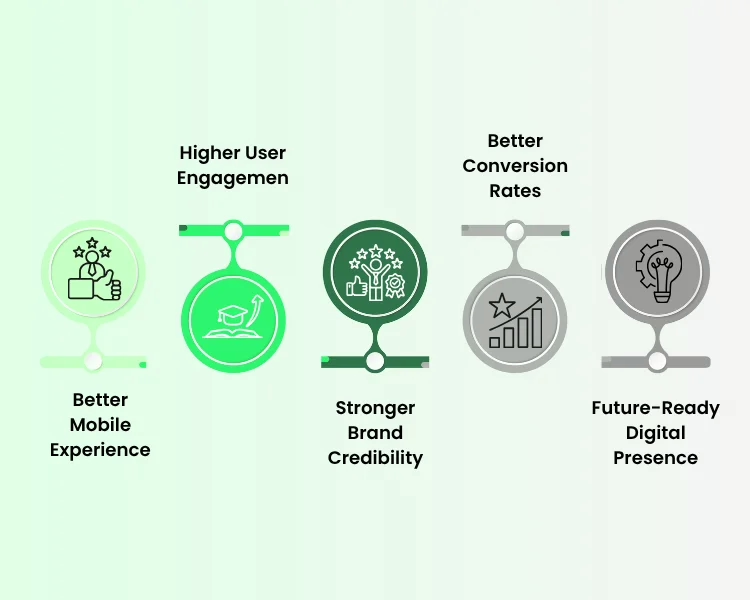
People today access websites through multiple devices, which creates a need for businesses to develop solutions that function on all platforms. The design of your website needs responsive elements, which will maintain its visual and operational standards across all types of devices. Your website design improves engagement levels while establishing trust with users and increasing conversion rates.
1. Better Mobile Experience
Users expect to experience uninterrupted browsing on their smartphones. Mobile-friendly websites change their text and images, and buttons to display correctly on smaller screens. The restaurant website demonstrates mobile responsive design when the menu displays correctly on your phone.
2. Higher User Engagement
The websites maintain visitor engagement for extended time periods when their navigation system functions at a basic level. Users can browse websites without using zoom or scrolling through web pages endlessly because of responsive web design. Google research indicates that 61% of users abandon websites that present difficulties for mobile use.
3. Stronger Brand Credibility
Users establish trust through modern website design, which establishes their credibility. People consider your brand trustworthy when your website displays a professional design across all devices. On the other hand, websites that lack proper design elements present themselves as outdated.
4. Better Conversion Rates
Mobile optimization establishes itself as the key factor that affects conversion rates. The eCommerce store provides customers with an easy product browsing experience through its responsive web development system. Customers who visit the website now show an increased likelihood of completing their purchase.
5. Future-Ready Digital Presence
The market introduces new devices together with new screen sizes, which will exist throughout the future. The flexible responsive website design solution creates automatic site adjustments.
Why Businesses Should Invest in Responsive Web Development
The initial benefit of responsive website design enables websites to maintain a uniform appearance across different devices. Users can start browsing on a phone and continue on a laptop without confusion. The layout, together with the text and navigation system, keeps the same appearance for users.
The design enables mobile users to read content better while accessing the website. The system improves usability through better button access, automatic image resizing, and simplified menu operations. Users spend extended periods on your mobile-friendly website because of this feature.
The system provides users with fast performance as its main advantage. The right mobile optimization techniques minimize loading problems and enhance system performance. Google reports that 53 percent of mobile users abandon websites that require more than three seconds to load. Businesses use responsive web development because it keeps their visitors interested.
Does Responsive Design Help with SEO Rankings?
Yes, it does, as search engines give priority to websites that deliver easy mobile browsing experiences. The implementation of responsive web design systems helps websites achieve better search engine ranking results. Google uses mobile-first indexing to assess your website design by first examining its mobile version.
1. Better Mobile Search Performance
- The page usability of your website improves through mobile optimization. The search engines demonstrate higher ranking results for your mobile-friendly website because of this aspect.
- Google shows that mobile-friendly websites achieve better search result performance according to their research.
- Business organizations implement responsive website design because it increases their online presence.
2. Lower Bounce Rate
- User spending time on your website increases when your responsive web design functions correctly.
- Visitors to poorly optimized websites will leave the site within a short time period.
- The engagement signals from users improve the SEO performance of responsive web development because they enhance website traffic.
How to Make Your Website Responsive?
To create a responsive website, developers need to establish their development process through planning and design strategies and the use of current development techniques. A responsive website design needs to deliver three essential elements, which include flexible performance and user accessibility.
The combination of effective website design with correct mobile optimization practices enables you to provide users with a unified experience across different devices.
- Use Flexible Layout- The technique establishes responsive web design as its essential element. The system enables your content to transition between different screen sizes without any interruptions.
- Optimize Images for Mobile- Through the mobile optimization process, developers use compression to create images that load at faster speeds. The process of responsive web development leads to better website performance.
- Design Mobile-first Interfaces- The design process begins with mobile design, which expands to include larger display areas. The method creates a website design that provides an optimal mobile user experience.
- Use Responsive Frameworks- Web developers use responsive frameworks to design their websites. The Bootstrap framework provides web developers with prebuilt components that automatically adjust according to different screen dimensions.
- Test Across Multiple Devices- A successful responsive website design must work everywhere. The testing process involves developers using phones, tablets, and desktops to verify system performance.
- Speed and Performance- Fast websites keep users engaged. The flawless combination of efficient coding and mobile optimization provides the end product with an attractive performance.
Conclusion
Most people get acquainted with your brand through your website. That’s the main reason why responsive design becomes a key factor in offering an uninterrupted experience across different devices. Your visitors will not only stay longer and trust your brand when your site easily adjusts itself to various screen types, but also be more ready to take the desired action.
If you’re aiming for a multi-device compatible site, Eiysys can provide you with a team of experts for that. They will create a website that is not only super fast and easy to use but also up-to-date and capable of delivering actual results. Contact Eiy Sys and go ahead to a more proficient digital presence for your business with them.
Frequently Asked Questions
Responsive website design benefits all devices, including smartphones, tablets, laptops, and desktops. It allows your website to adjust automatically to different screen sizes. As a result, users enjoy a smooth browsing experience no matter what device they use.
Yes, it is very important for small businesses. A responsive web design ensures that customers can easily access your website from their phones. This improves credibility and helps small businesses reach more potential customers online.
Mobile optimization improves loading speed, navigation, and readability on smaller screens. Because of this, visitors stay longer and interact more with your content. A well-optimized mobile site also reduces bounce rates.
Yes, a mobile friendly website makes it easier for visitors to browse, read, and take action. When users can quickly find information on their phones, they are more likely to explore your services and stay on the site longer.
Developers often use frameworks like Bootstrap, CSS Grid, and media queries. These tools help create flexible layouts that adapt to different screen sizes. As a result, responsive web development becomes faster and more efficient.

Jasleen Kaur
Hi, I’m Jasleen, a content writer and SEO enthusiast who loves turning ideas into engaging, reader-friendly content. I create blog posts, articles, and web copy that not only inform but also help websites rank higher on search engines. Combining st...read more